For our Design Studio 4 unit, we were task to create a masterplan to reactivate and bring life to the Waterfront in Docklands, Melbourne. First, we were ask to create a sandbox for our design forms. Simoustanly, we also analysed and researched the history and the present of the site. This gave a better understanding of how we could improve the user experience of visiting Docklands.
Group Members
In Part A1 we were asked to capture the form of our techniques, which is water, using various equipment and tools, and show the making process and the components of our sandbox system
In our 1st experiment, we pushed a piece of TIMBER along the water to create waves. We found out the timber creates vortex behind the timber which is filled with air. Because of these air pockets under the water level, it displaces a huge body of water, in turn, created these waves as shown in ORANGE water.
In our 2nd experiment, we dropped a MARBLE into the water. When the marble hit the surface, the water violently formed up into groups for a brief moment before it despiting back into the water creating small waves, shown in GREEN water.
3rd experiment, when pushing a FORK against the water, 2 major things happened. Under the water, the water was more uniformed, it created a stream because of the gaps in the fork, allowing the water to flow through them.Above the surface, the water had no gaps to flow through, cause the water to build up and creating a wave, shown in BLUE water.
4th experiment, we used a PEPPER SHAKER to see if dropping an object with a larger volume change the shape of the water. However, the outcome was quite similar to experiment 2. They formed into a group at the centre of the impact before distributing the water particles in every direction. The difference is that the effect of the water was bigger due to the shape angles of the pepper shake and its volume compared to the small marble. Shown in YELLOW water.
5th experiment, we pushed the TONGS to the right. The water was bouncing back and foth on the arms of the tongs, creating a knot like shape and multiple smaller vortex. Shown PINK water.
In Part A2, we needed to create variations of iterations based on the movement of water we have learnt in Part A1. We expand our knowledge of the water by doing a deep dive analysis of all the experiments by showing graphing the forces and parameters acting on water. After that, we did some quick iterations to get an idea of the shape we wanted before creating some final iterations.
In Part A3, after developing the system and exploring the limitations and capability of generating different we were assigned to create a form and produce a functional program for it
Application One. This form was inspired by our 1st Experiment We did in part A1. We used the images we took,studying it, and trace it to create our graph for this application. We started by creating the Contour Lines from the graph, adding the Outlines,than Lofting before finally extruding it to createthe Form. The shape is heavily inspired by the shape of the vortex created from the timber. We Increased the degree of the curves lines to create a more interesting design. increased the degree of the curves lines to create a more interesting design.
This application is aimed to be used in the open, preferably in green spaces or a park because of the divided roof. Sunlights are able to seep into the gaps and create very pleasing shadows, during the morning and evening.
Application Two. For the second application we use the Matrix From Iteration - Experiment 5, used the variables and parameters to guide us when creating this graph. When we found out our ideal shape westarted creating the digital application in Rhino, using this method.
Before adding objects to our final scene, we created some holes in the model. This is to allow lights to shine through the Pavillion and light up any dark place underneath it. The holes serve another benefit, it is a great way to add trees and other vegetation to the place. The contoured steps let people sit down and relax while enjoying the view.
Surrounding Buildings in the Docklands are made up of different classes these include fromoffices, factory, residential, commercial, warehouse, to educational buildings for boat classes.
Circulation by transport/vehicles is mostly dominant mainly due to the heavy traffic on the highway and major roads surrounding the site, however, the majority of circulation within 500 meters of the site are mostly pedestrians due to there being more footpaths than roads
Roads. The site is very close to one of the busiest highways in the state, due to the fact they are the connection link to other cities such as Geelong and Bendigo, and across the entire state of Victoria.
Transport. The site very accessible since the nearest Train and Tram Stations are less than a 1km away. Public transport can carry people from different city, towns and the outer suburb of Melbourne to the proposed lot.
Topography. Since docklands is a couple of kilometres away from the coast, the site and its surrounding landare mostly flat with some small hills.
Nature. There are very few places that have parks and recreational spaces within 1.5 kilometers from the site. Even if there are grass areas (ie alongside the river at the north) they are not accessible for the pedestrian and for the public use.
Views. Since it is surrounded by the river, you can get a 360-degree view of the neighbouring area. Because of the orientation of the site you can see the Bolte bridge,the Ferris wheel, pier and other iconic buildings in dockland. We would love to take that advantage of the view and incorporated into our design.
Docklands North Wharf has been an iconic element in assisting Melbourne create its identity. From its significance and relationship to the Australian indigenous, The aid of support for World War 1 & 2 and the first step onto Australian Soil that many of our grandparents and parents had to experience to give us a better life. Since then we believe that the space has been abandoned and no longer relevant to the history of Melbourne. We envision the site to bring back it’s identity through fluidity and connection with water. Ourdesign, we believe, has to capability to bring forth a “wave”of exciting ideas to area.Our new keywords identify our new design choices of which we would like to implement. We believe that this will be better suited to the overall Masterplan.
Our initial inspiration was drawn from a previous form we had created through one of our matrixes. We found this particular form worked well as it allowed us to focus on this sense continuity by creating an organic feel. We found the form allowed us to instantly see how the zoning throughout the site should be split up into sections, across light and dark spaces within the image. Openings in the water.
With the brief available to us we could begin creating Schematic diagrams to communicate the zoning areas. Using multiple ideation, spacial arrangements and our foundation concept plane created from our form finding we proposed a variety of site layouts to ensure that the most sustainable and practical idea was implemented. Our main basis for the site was to include the following:
- Aquatic Centre
- Office Space
- Exhibition Centre
- Boat Building Workshop
- Education Centre
- Plaza Space for food and drink stalls.
Each one of the members were able to produce their own interpretation of the site in 1:500 as well as 1:250 scales. Once all the plans were submitted we could then combine to create the final zoning.
A combination of ideas allowed us to incorporate the best schematic design layouts and merge together to begin forming a mass model of our concept. Our original concept and feedback was to research into connection to water,paths and built form so the introduction of elevated pathways were implemented. Having these pathways allowed for our site to be completely connected. Each building area was accessible directly from another which assists the user in circulation and experience. The forms of all our designs represent that of a unique point of form finding that we recorded in the micro system documenting and iterating. We believe that from our research in schematic design this is the most sufficient site layout that would be relatable to both our site analysis and form finding. The Diagram communicates the points of interest within the site as perspective and its relation to the pier foundation.Through further development we will finalise our building designs internally and externally as well as introducing detailed construction methods to communicate our design and how it works within the site the basement floor tobe used for
Flowville, a concept inspired by capturing the movement of water and the impact an object has when distorting the water’s surface in order to create,fluidity, connection, circulation and activity within a site. From zoning to footpaths to edge quality, everything has been inspired by these 4 key words which ultimately are the driving forces behind our final design. With the inclusion of public plaza to act as a focal meeting point, an aquatic center complete with waterfront pools and steps to encourage user interaction with the water, as well as an exhibition space, a boat building shed, an education center we are able to create a site which attracts locals and tourists alike, all connected by a multiple strand of pathways and bridges representing the chaos created by distorting the water’s surface, focusing on a sense continuity by creating the feel of spatial flow
We wanted to incorporate the sea-level changes in our design instead of looking at it as a problem. To integrate this opportunity to our site, we added a series of unique steps in front of the aquatic centre and pools. The steps would lead down and slowly transition into the Yarra river. The shape of steps and the paths will slightly change each passing day depending on the water level. Meaning that every time you visit the site, the experience of walking along the Yarra River and interacting with the water will be different and alter over time.
The contoured plaza that represents curve of water on impact. Below is a conjunction of various spaces through a series of steps and levels which lead to the waters edge encouraging user interaction with the water's surface, whilst above are subtle oscillate like paths representing the direction of water and the relationship that the user will experience. All paths tie into the foundation, the buildings and water so you can feel the circulation on the site
The aquatic centre is heavily inspired by the form of the “fork-pull” experiment. The idea of transitioning from an organic design language to a more firm design language with straight angles is what makes this design unique to other buildings in Docklands. The multiple paths allow people to move both horizontally and vertically within the aquatic centre and the waterfront edge. This movement allows people to get a sense of what it is like to flow and connects with water and the Yarra River. The intertwining of the paths was a direct copy of the water movement and forces acting on it from the “fork” study.A green roof is added to allows tourists and locals to access the rooftop of the aquatic centre and enjoy the 360-degree view of Melbourne. This idea also increases our vision of having“80% green space” within the site, a must needed feature for Docklands
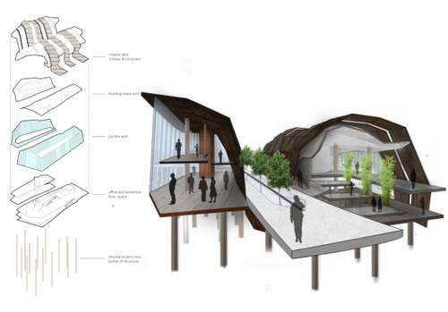
Continuing with the theme of separating the boat shed workshop and education centre we wanted to create each building to have a unique experience within each one. We did not want to take away and isolate the buildings completely though. Using the interconnecting paths each building is joined by bridges and entrances that flow into each other. Both buildings are also open to public with large curtain walls surrounding the areas for a look into what is happening in the site.The boat shed is 12m tall in it’s highest point. This is due to the large wave effect that we created with the roof. The reason for this height on a single story is because we designed the building to manufacture and work on boats. This has increased the existing sites height by an extra 5m. This should be more than enough the facilitate for sailboats. On the second floor we incorporated break out spaces and bathrooms as the current conditions of the site did not make this accessible.The education centre is a multi-level learning hub. We wanted to incorporate the Public so they are aware of the history of Port Melbourne which has been forgotten over the years. We have done this by introducing a public lecture area as long as a break out bench seating amongst plants. Shared study spaces allow for marine biology or boat builders to work within a confined area. As the area is completely public, a large ramp goes from the second floor right through the bottom
We wanted to incorporate the sea-level changes in our design instead of looking at it as a problem. To integrate this opportunity to our site, we added a series of unique steps in front of the aquatic centre and pools. The steps would lead down and slowly transition into the Yarra river. The shape of steps and the paths will slightly change each passing day depending on the water level. Meaning that every time you visit the site, the experience of walking along the Yarra River and interacting with the water will be different and alter over time.